
My brand mark process
Whether I’m designing a custom brand mark for a client, or creating them for my templates, they all start the same way; analogue first, digital second.
But before I pick up a pencil, I spend time sitting with a client's work. What do they make, do or design? What is the personality and tone of the brand? How do they want to be seen through the eyes of others?
A garden designer who works with naturalistic planting has a completely different energy to one who creates structured, formal spaces — and the mark needs to reflect that. So does a photographer whose work is editorial and atmospheric, versus one whose aesthetic is playful and light.
I'm thinking about what kinds of shapes feel right: whether something needs to be open or contained, gestural or precise, botanical or abstract. I'm also thinking symbolically — what does this mark need to carry?
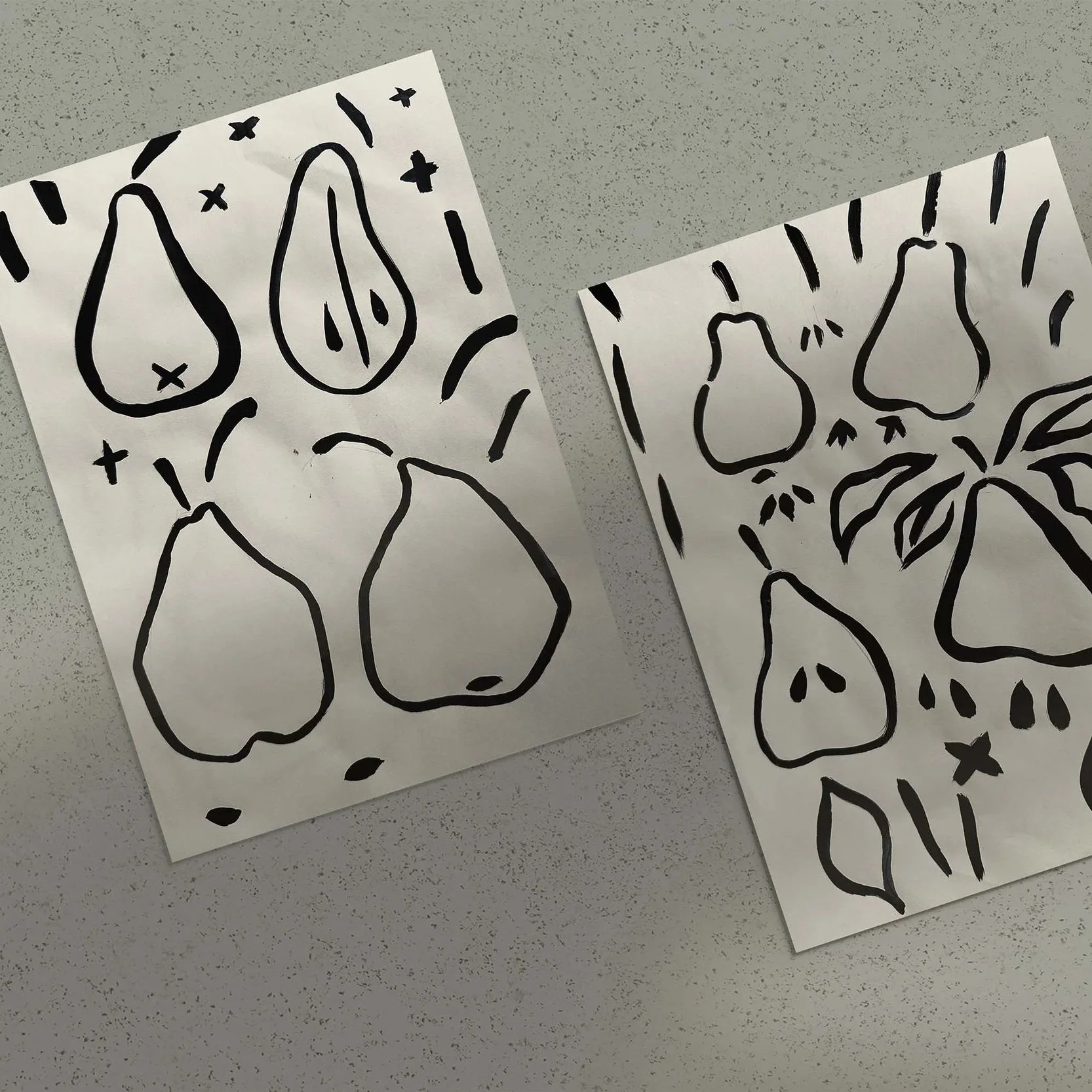
Once I have a sense of direction, I sketch. These are loose, exploratory — I'm looking for the right skeleton of a shape, not a finished thing. I might sketch the same form a dozen times, testing where the weight sits, how it reads at different scales.
Then comes the part I love most. I paint over the sketches using black ink or paint on white paper for maximum contrast — usually with a brush, sometimes other tools — to find the texture, the movement, the life in the marks.
For me, paint does things a digital line can't. The fact that it is harder to control is what I love about it. It’s what gives it character. That slight imperfection is exactly what I'm looking for— the quality that makes a mark feel hand made rather than generated.
From there, the painted mark is vectorised in Illustrator — traced and refined so it scales cleanly. I am then free to recolour it to suit the brand it belongs to.
You’ll notice, I rarely try to capture the whole brand mark at once. Instead I am free across the page with the elements. The Outlines of pears, pips, stalks and leaves. This allows me to play with ideas until it feels ‘right’ on the digital artboard. The process is like a creative puzzle to me.
The marks I create have two lives. Some are made for my website templates: designed to work beautifully within a specific template aesthetic. These are available for you to buy and have recoloured, in the custom colour of your choice.
Others are created as part of a bespoke brand project — built entirely around one business, and one story.
Either way, the process is the same. And so is the intention: a mark that feels like it could only ever belong to you.
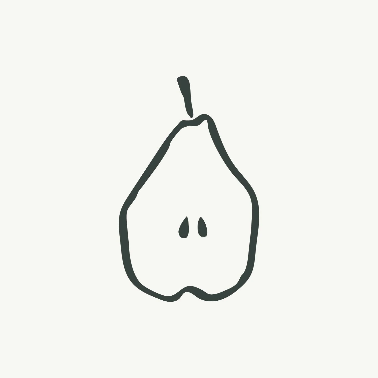
The Tosca is a hand-painted pear, designed to work as a brand mark for your business. Clean, distinctive and quietly considered, it suits food photographers and stylists, garden designers, caterers and anyone who wants their online presence to reflect the quality of their work.
Use it wherever your business shows up online — your website, social media profiles, email signature. When a small visual detail appears consistently across everything you do, it makes your whole business feel cohesive and intentional.
At checkout, you'll enter your brand colour as a hex code and I'll customise the mark to match. Each order covers one colour. If you'd like the same mark in multiple brand colours, simply place a separate order for each.
Your customised files will be delivered within 5 working days.